Please Don't Force Dark Mode
Dear website designers,
Please don't force dark mode on your users. If dark mode is a characteristic of your brand, please ensure you choose a comfortable contrast ratio for the text.
I regularly see many websites including personal blogs that are designed exclusively in dark mode. I find this incredibly frustrating as I can't even read a single paragraph on these sites before my eyes start watering. While dark mode can be beneficial on some occasions, forcing it on users is a terrible user experience.
My Eyes! My Eyes! 😵💫
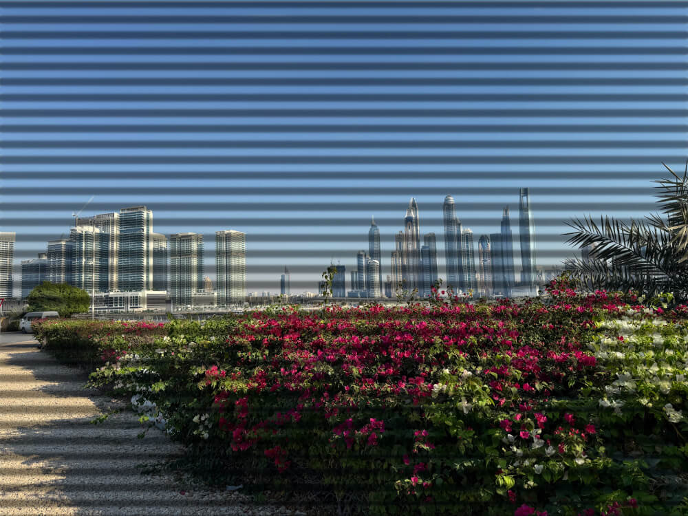
Reading in dark mode affects my eyes even after I'm done. After finishing a long article, I keep seeing horizontal stripes everywhere, as if my eyes can't adjust back right away.
This is what my eyes see before reading a dark-mode article:

And this is what my eyes see after reading a full-length dark-mode article:

What's the real problem with the dark mode?
The real problem is the contrast ratio between the text and the background when using dark mode.
For example, pure white text on a pitch black background can strain my eyes and be very difficult to read. The contrast ratio of this combination is 21:1. Here's an example paragraph:
Lorem ipsum dolor sit amet, consectetur adipiscing elit, sed do eiusmod tempor incididunt ut labore et dolore magna aliqua. Ut enim ad minim veniam, quis nostrud exercitation ullamco laboris nisi ut aliquip ex ea commodo consequat. Duis aute irure dolor in reprehenderit in voluptate velit esse cillum dolore eu fugiat nulla pariatur. Excepteur sint occaecat cupidatat non proident, sunt in culpa qui officia deserunt mollit anim id est laborum. Lorem ipsum dolor sit amet, consectetur adipiscing elit, sed do eiusmod tempor incididunt ut labore et dolore magna aliqua. Ut enim ad minim veniam, quis nostrud exercitation ullamco laboris nisi ut aliquip ex ea commodo consequat. Duis aute irure dolor in reprehenderit in voluptate velit esse cillum dolore eu fugiat nulla pariatur. Excepteur sint occaecat cupidatat non proident, sunt in culpa qui officia deserunt mollit anim id est laborum.
However, gray text on a black background is easy on my eyes. In the below example the text is #888888 which creates a contrast ratio of 5.9:1.
Lorem ipsum dolor sit amet, consectetur adipiscing elit, sed do eiusmod tempor incididunt ut labore et dolore magna aliqua. Ut enim ad minim veniam, quis nostrud exercitation ullamco laboris nisi ut aliquip ex ea commodo consequat. Duis aute irure dolor in reprehenderit in voluptate velit esse cillum dolore eu fugiat nulla pariatur. Excepteur sint occaecat cupidatat non proident, sunt in culpa qui officia deserunt mollit anim id est laborum. Lorem ipsum dolor sit amet, consectetur adipiscing elit, sed do eiusmod tempor incididunt ut labore et dolore magna aliqua. Ut enim ad minim veniam, quis nostrud exercitation ullamco laboris nisi ut aliquip ex ea commodo consequat. Duis aute irure dolor in reprehenderit in voluptate velit esse cillum dolore eu fugiat nulla pariatur. Excepteur sint occaecat cupidatat non proident, sunt in culpa qui officia deserunt mollit anim id est laborum.
In summary, higher contrast ratios in dark mode cause discomfort for my eyes. But when I say 'higher', just how high can it go?
Isn't there a guidelines for this?
The current Web Content Accessibility Guidelines (WCAG) 2.1 specify a minimum contrast ratio of 4.5:1 for normal text (SC 1.4.3), but they do not set a maximum limit. As a result, combinations like pure white text on a pitch black background with a contrast ratio as high as 21:1 are considered fully accessible under these rules, even if they cause discomfort for many users. In short, existing guidelines do not address the potential issues of excessive contrast in dark mode.
Upcoming WCAG 3.0 adds a new exploratory requirement for "Maximum text contrast" and I hope the working committee will address the issue of high contrast text in dark mode and provide suitable recommendations.
Update on December 2025: The requirement "Maximum text contrast" has been removed in the 04 September 2025 update of WCAG 3.0 draft. You can see the old version here. The GitHub Issue for contrast ratio math is still open here.
Until then, if I must read an important article that forces dark mode, I will use the browser's developer tools to override the CSS and invert the colors until a better solution is available. I don't want to use a plugin just for this.
That being said, I absolutely enjoy dark mode when...:
- ...reading on an OLED screen in a unlit room, for example reading articles on my phone before bedtime. Dark mode works best on LED-type displays when used in dark environments.
- ...writing code. Almost every IDE has a dark mode with very comfortable contrast ratio out of the box.
- ...the website has comfortable contrast ratio in the dark mode.
Note: This article sparked a vibrant and insightful discussion on Hacker News.↗ The thread features a mix of approvals and criticisms of the viewpoints shared, along with fascinating discussions on topics such as how early OEMs decided between dark mode and light mode, the significance of contrast ratios, and personal experiences—including medical conditions and accessibility challenges. It also highlights creative workarounds, thought-provoking debates, and even some gaslighting!
To fully appreciate the nuances of this topic, don’t miss the valuable perspectives shared in the Hacker News thread.