Apple's Liquid Glass UI: Flutter Will Struggle
Update on 2025-06-11: An engineer from the Flutter team has confirmed that they are not bringing the Liquid Glass feature in Flutter.
"...we are not developing the new Apple’26 UI design features in the Cupertino library right now, and we will not be accepting contributions for these updates at this time."
— Kate Lovett on GitHub
Apple just announced its first major UI redesign in years: "Liquid Glass". It's meant to bring a consistent, futuristic look across all Apple platforms — iOS, macOS, iPadOS, tvOS, and watchOS — starting with version 26 this fall. It really does look like something out of a sci-fi movie, and it gives all iDevices a fresh look.
But what I'm really curious about is how the Flutter team is going to handle this. Honestly, I think Flutter is going to have a tough time. Here's why.
The Core Issue: Flutter Renders Everything on a Canvas
Flutter draws its UI on a canvas, ignoring the underlying platform — iOS, Android, web, whatever. That's why Flutter apps look the same everywhere. If you want a platform-specific element, you end up doing platform checks like if(Platform.isIOS) to render pre-built, platform specific widgets, which gets messy fast in a big codebase.
Struggle #1: Adapting Liquid Glass
People are going to love Liquid Glass. It makes old devices feel new again. Beyond just looks, it allows UI elements float over the content, making the actual content render edge-to-edge, making it more enjoyable. I bet we'll see new design patterns pop up soon.
But for Flutter, this is a headache. Since everything is painted on a canvas, the Flutter team will have to recreate the Liquid Glass look — UI, UX, and all the fancy glass shaders. And they'll need to do it fast, since the new UI lands this fall.
Even if Flutter pulls it off, developers still have to write platform-specific UI code, especially for older iOS versions where Liquid Glass isn't available. That's a lot of extra work.
Struggle #2: Apple Will Keep Tweaking Liquid Glass
As much as people love it, they will hate it too.
The transparent, squiggly design is bound to cause new accessibility issues — like white text over a busy background being unreadable. Once millions start using Liquid Glass, feedback will pour in. I've already seen people on X and Hacker News mentioning readability issues just from Apple's demo video, so you can bet more complaints are on the way.
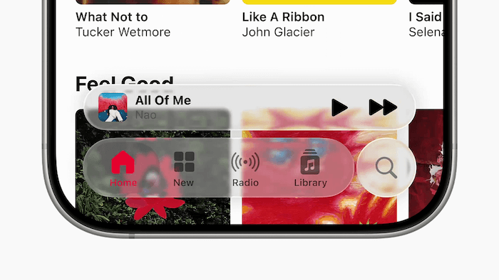
Consider this example from Apple's demo videos: the "Home" icon and its label become difficult to read when the background color closely matches the foreground elements.

Apple will probably add settings for things like "Transparency" and "Viscosity", letting users fine-tune the effect. Suddenly, Liquid Glass could look different for every user — tinted, less squiggly, more grainy, whatever.
Flutter will struggle to keep up with these changes. It's not as simple as switching a background color for dark mode — you'd have to actually respect the user's current UI settings.
Struggle #3: UI Divergence — Material 3 vs. Liquid Glass
Just two weeks ago, Google announced Material 3 "Expressive" for Android. Now Apple has Liquid Glass. The design languages are diverging fast. Users will expect apps to match their platform's look and feel. This is where cross-platform tools like Flutter will fail in the near future.
Conditionally rendering UI for each platform gets as time-consuming as just writing native apps in Swift or Kotlin. As your app grows, the codebase gets harder to maintain.
Update on 2025-06-11: Flutter team may completely re-architect how they implement the UI layer. Let's wait and see.
"The arrival of major updates for both Material and Cupertino presents a significant (and exciting!) opportunity to apply past lessons and reconsider the long-term architecture for design system integration in Flutter. To evaluate this, we have begun a broad investigation into our current approach. This includes exploring various architectural possibilities..."
— Kate Lovett on GitHub
So, What's the Best Option?
I wrote an article three years ago on how to pick the right tool — native or cross platform — for your next app idea. It's the right time to update the recommendations.
With design languages splitting like this, my advice for your new app: if you really want to reduce time and cost, use native UI with cross-platform logic. Kotlin Multiplatform is a solid choice — you can write native UIs in SwiftUI and Compose, but share business logic (database, APIs, storage, Bluetooth, etc.) in Kotlin, since it compiles to native code for both iOS and Android.
Note: Compose Multiplatform (not to be confused with Kotlin Multiplatform) lets you share UI code across platforms like Flutter, but the key difference is that Compose Multiplatform supports embedding native UI components when needed. This gives you flexibility: you can use shared UI and embed platform-specific experiences. Here's a tweet from Jim Sproch, the father of Compose.
You can use canvas widgets which are easily cross-platform out of the box (like Flutter). You can use platform widgets (like ReactNative). Or you can use a mix of both. Compose is completely unopinionated, best of both worlds.
— Jim Sproch (@JimSproch) June 11, 2025
Let's see how this all plays out. But for now, I'm betting Flutter is in for a rough ride.